L.B. Foster
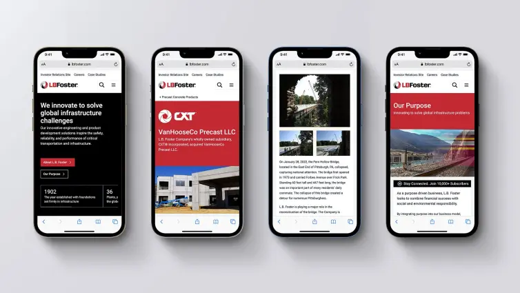
An ambitious project for L.B. Foster, successfully modernising their online presence and consolidating over 5000 pages from multiple websites into a single, easy-to-use global website.
The Challenge
L.B. Foster had an outdated .com website that was difficult to manage and a collection of related but disjointed websites inherited from multiple acquisitions in America and Europe. The user experience was fragmented and the technical overhead of managing many sites was inefficient.
L.B. Foster wanted a single streamlined website, improving usability, simplifying management, and incorporating multilingual support to better serve its global audience.
This ambitious 22-month project, involved the consolidation of thousands of pages across L.B. Foster's website portfolio. Teams based in both the UK and the US worked together to seamlessly deliver this huge website.
L.B. Foster's marketing team praised D3 Creative for open and transparent communication, which was instrumental in ensuring a smooth workflow throughout the project. This successful undertaking underscores our commitment to delivering high-quality website redesign services that result in significant, tangible benefits for clients.
About the Client
L.B. Foster, founded in 1902, is a prominent American company in construction and infrastructure. While it has been a key player in numerous American projects, it has also expanded internationally.
Through strategic acquisitions in Europe and the United States, L.B. Foster has broadened its capabilities and global presence. This expansion underscores its dedication to worldwide infrastructure development, establishing L.B. Foster as a major international player in the construction and infrastructure sector.
The Solution
D3 Creative crafted a focused, modern website, prioritising not just visual appeal but also user experience. The new design features intuitive navigation paths, making it easier for visitors to find information about L.B. Foster's innovative solutions and projects.
This overhaul didn't just transform the website's look; it significantly enhanced how L.B. Foster connects with clients, partners, and the broader industry, showcasing their capabilities and strengths in a way that resonates with and engages their global audience.
What we achieved
Website traffic improved
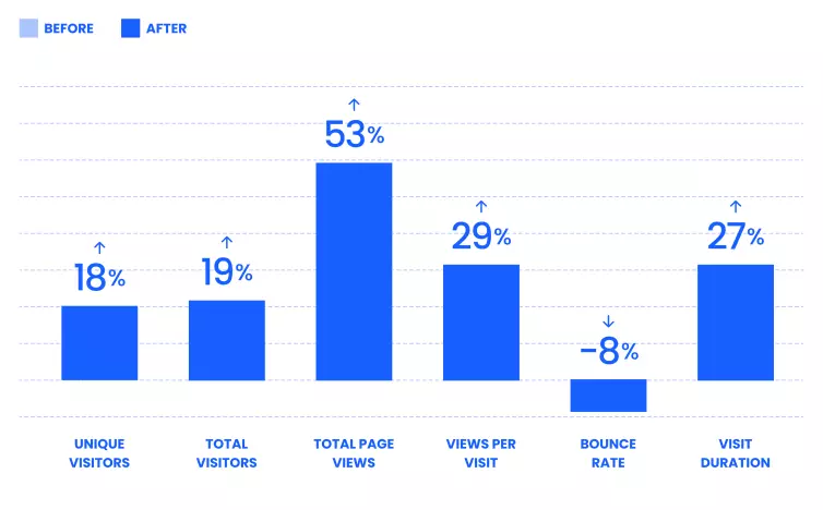 Website Analytics Data: 47 days since launch.
Home Page Performance
The original home page was a juggernaut at 15Mb, the new page is 88% smaller reducing the load time to less than a second, that’s a speed increase vistors will notice, this could in part account for the 27% increase in visit duration and 8% reduction in bounce rate.
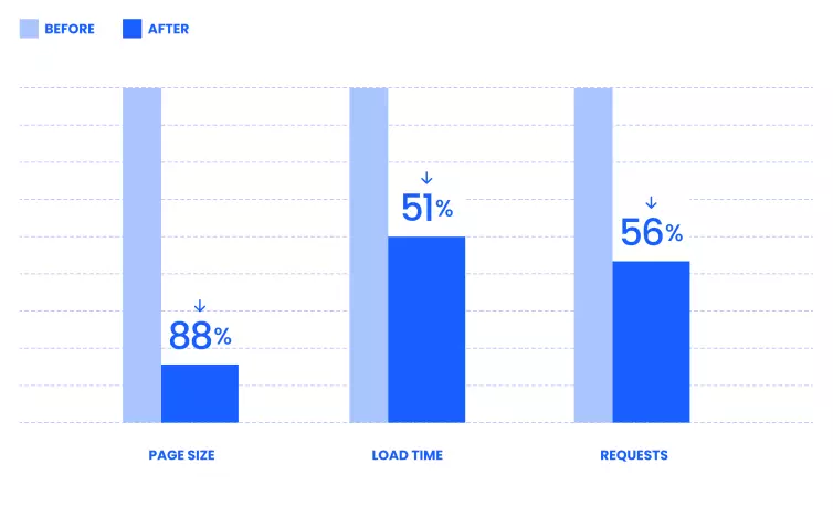 Page size, load time and number of requests reduced.
Optimising page performance is a crucial aspect of modern website development, faster loading pages encourage exploration and improve user satisfaction. It also contributes to achieving business goals such as increased traffic, lower bounce rates, and improved conversion rates.
Home Page Performance Improved
The home page of a website is often the first point of contact a customer has with a business. It needs to load quickly to provide a smooth experience on mobile and desktop.
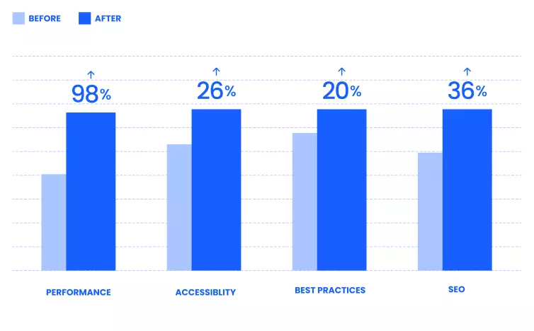 Home page Lighthouse scores at launch.
All performance metrics for the home page saw significant improvements, ensuring a faster and more efficient user experience. The same care and attention to performance was applied to the development of the other 16 page templates too.
Page indexing
To date there has been a massive 707% increase in pages indexed by Google. The number of pages appearing in Google searches (Impressions) has rose by 92%, and volume of people clicking though to the website has increased 14%. Indicating a significant boost in the website’s visibility and reach.
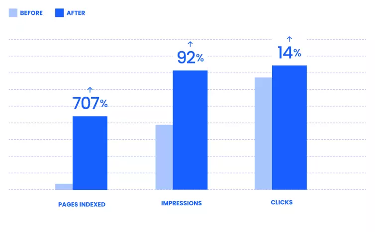 Traffic metrics: 47 days since launch.
Testimonials
"We’ve worked with D3 Creative over several projects and Stephen was our go-to person when the concept of a new global website became a reality. The challenge was not just to redesign and create a new site, but to finally integrate a handful of other sites into the new .com site".
Phil Chester, Head of Marketing Europe, L.B. Foster
"Working with Stephen on our new, global website for L.B. Foster has been, in a word, seamless. He is detailed, organised, and collaborative with our team at L.B. Foster as well as other third parties involved in the process".
Caroline Toplak, Global Corporate Marketing, L.B. Foster
What we did
Research & Planning
In the initial phase, comprehensive audits provided valuable insights into existing websites, serving as the foundation for planning and essential benchmarks for progress tracking. Additionally, a key component of this phase was the creation of a visual sitemap, used as a blueprint to communicate the proposed website's scope clearly.
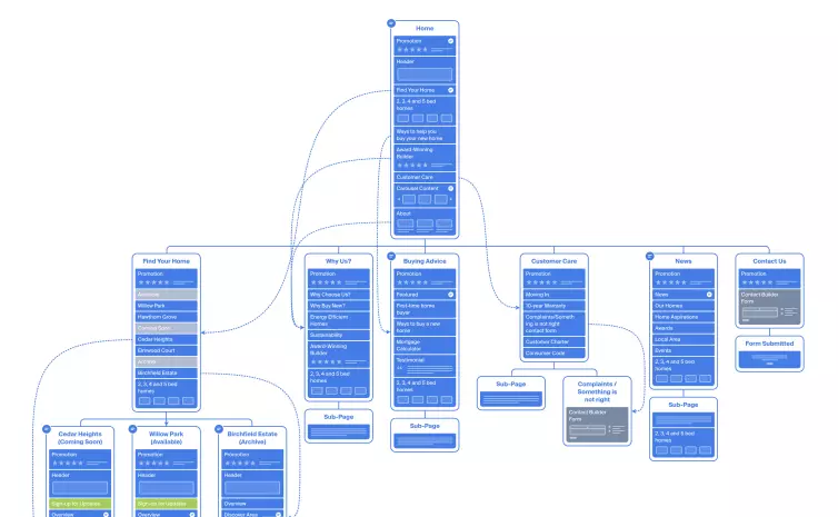 An example of a visual sitemap
Wireframing
We created interactive wireframes for mobile and desktop screens, a crucial step in shaping the website. Weekly meetings, involving both the UK and US teams via Microsoft Teams, played a key role in discussing page content and user flows as the website took shape.
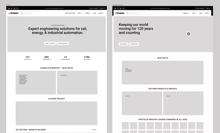 Desktop wireframe examples.
Design
An essential aspect of website design is the creation of reusable components. Each web page is essentially an assembly of carefully designed components. Adopting a component-oriented approach, as opposed to a page-oriented one, proves to be more efficient and mirrors the subsequent development process.
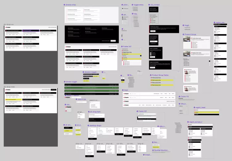 A selection of components designed for the new website.
Development
We prioritised building the editing experience within the CMS first, this meant the marketing team could input content during development, instead of at the end.
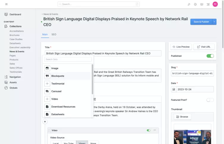 Screenshot of the CMS editing experience.
This approach had a few advantages: it enabled an early start to content creation (a common bottleneck), provided a structured repository for website content, and ensured that everyone was proficient in using the CMS on launch day.
It also made it straightforward for the team to identify areas of the website that required additional content, enhancing the overall development process.
Launch & Monitor
After the website's launch, we monitored performance for a period of 45 days using Google Search Console (GSC). We identified and addressed any issues promptly. This ensured that the website operated smoothly and was well-received by search engines.
A Trusted Partner
In wrapping up, the partnership between D3 Creative and L.B. Foster in revamping lbfoster.com has been a triumph. The merger of multiple existing websites into one coherent platform, the launch of a multilingual interface, and the strategic planning and development have all been pivotal in achieving remarkable results.
Analytics showcase a surge in site traffic, a boost in user engagement, and an elevated visibility in search rankings. Enhancements in site performance have not only slashed load times but have also refined the overall user journey.
The debut of the new lbfoster.com is a defining moment for L.B. Foster, establishing a fresh standard for their online presence and reaffirming their status as an industry frontrunner within the construction and infrastructure arena.
We continue to work with L.B. Foster to coordinate additional site improvements, new pages and additional creative support.

