
Why is web design important?

Key Takeaways
Visitors form a first impression of a website in about 50 milliseconds, so design decides whether they give your content a chance.
A clear layout and plain navigation labels help people find what they came for without thinking about it.
Page speed is mostly decided at the design stage, by what each page is asked to load.
Clear page structure helps search engines understand and index your site.
Accessibility problems are cheapest to fix in the design, before anything is built.
Use design trends only when they suit your brand and visitors, and never at the cost of speed or usability.
Why is web design important? The clearest answer I have comes from a real project. When I redesigned L.B. Foster's global website, the homepage shrank from 15 megabytes (MB) to 1.8MB, and its load time dropped from over 8 seconds to under 1 second. Over the same period, visit duration went up 27% and bounce rate went down 8%.
Speed won't explain all of that, but speed was a design decision: what each page needed to carry, and what it could leave out. Most of what makes web design important is like that. Visitors never see it, but it decides whether they trust you, stay, and find what they came for.
Here's what good web design changes, with examples from sites I've built and sites I think get it right (or wrong).
Visitors judge your site in a fraction of a second
People form a first impression of a website in about 50 milliseconds, according to a 2006 study by Gitte Lindgaard and colleagues. That's before they've read your headline.
Visitors form an opinion of your website in just 50 milliseconds. That's 0.05 seconds, about the time it takes to blink.
Lindgaard, G., Fernandes, G., Dudek, C., & Brown, J. (2006). Attention web designers: You have 50 milliseconds to make a good first impression! Behaviour & Information Technology, 25(2), 115–126. https://doi.org/10.1080/01449290500330448
In that time they're judging layout, colour, typography and how busy the page looks. If the site looks dated or cluttered, they assume the business behind it is too. Professional website design buys you the few seconds your content needs to do its job.
Consistency matters as much as polish. When colours, fonts and layout match across every page, and match your printed material and social profiles, the site feels like one organisation rather than a collection of pages. People recognise you the next time they see you.
I design beautiful, user-friendly websites tailored to your specific needs. Make a lasting impression and stand out from the competition. Take a look at my website design and build service to learn more.
Clutter makes people work harder
The fastest way to lose a visitor is to make them work out where to look. A clean layout with generous white space tells people what matters on the page, and in what order. Without it, everything competes for attention.
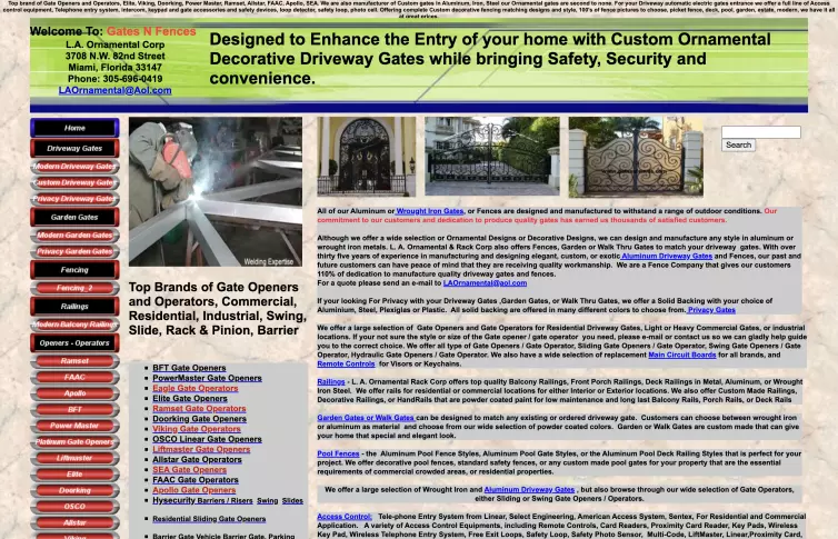
Gates N Fences is a good example of a website that doesn't make use of white space. https://gatesnfences.com
Clean doesn't mean empty. Before designing a page, decide what it's for and what you want someone to do next. Then give every element on it a reason to be there. That's the useful part of minimalist design: it isn't a look, it's a way of making choices.
Navigation is where this matters most. Use menu labels your customers would use, not your internal department names, and keep the menu easy to find on every screen size. Hiding it for the sake of a tidy design defeats the point.
It has to work on every screen
Responsive design means one website whose layout adapts to the screen it's viewed on, from a wide desktop monitor to a phone. You don't need a separate mobile site, and your content lives in one place.
It affects search too. Google uses the mobile version of a page to index and rank it, so a site that falls apart on a phone is judged by its worst version.
Check the detail, not only the layout: buttons big enough to tap, text you can read without zooming, and forms that don't fight the phone's keyboard.
Speed is a design decision
Page speed is usually treated as a developer's problem, but most of the weight on a slow page goes in at the design stage: background videos, huge uncompressed photos, five font weights, a slider nobody clicks. Each one looks harmless in a mock-up. Together they add up to a heavy, slow page.
The difference in conversion rate between blazing fast sites and modestly quick sites is astonishing. A site that loads in 1 second has a conversion rate 3x higher than a site that loads in 5 seconds.
Portent looked at just over 100 million page views across 20 business-to-business and business-to-consumer sites for conversion data. https://www.portent.com/blog/analytics/research-site-speed-hurting-everyones-revenue.htm
Decide what each page needs to load before anyone starts designing it, and treat every large image, video and font as something that has to earn its place. On L.B. Foster I applied the same attention to performance across all 17 page templates, not only the homepage, because plenty of visitors land on an inner page first.
Search engines read the structure
Search engines can't see your design, but they read what's underneath it. A well-designed page has a clear structure, which helps Google understand what it's about:
One main heading per page, with subheadings in a logical order rather than picked for their font size
Short, readable web addresses (URLs) that describe the page, not strings of numbers
Alternative text (alt text) that describes each image for people using screen readers, which search engines read too
Links between related pages, so visitors and search engines can find your deeper content
When L.B. Foster's scattered websites were brought together into one well-structured global site, the number of its pages indexed by Google rose 707% and its search impressions rose 92%.
Accessible design reaches more people
An accessible website is one people can use whatever their abilities: with a screen reader, a keyboard instead of a mouse, zoomed-in text or colour blindness. It is also a legal question. In Great Britain, the Equality Act 2010 covers services provided online, and public sector websites must meet the Web Content Accessibility Guidelines (WCAG).
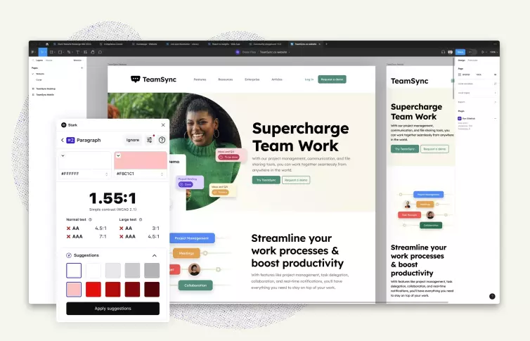
Most accessibility problems start in the design: pale grey text on white, links shown only by colour, buttons with no visible outline when you tab to them with a keyboard. They're cheap to fix in a design file and expensive to fix after launch. Stark is one tool that checks colour contrast and other issues inside design software such as Figma, before anything is built.
Standing out without chasing trends
In plenty of industries, a modern, well-built site already sets you apart, because competitors' websites haven't been touched in years. To go further, look at those competitors' sites and note what they do well and where they fall short. Then make the thing that's different about you obvious on your own site, rather than borrowing their layout.
Design trends can help, but only when they suit your brand and your visitors. Here are three I like when they are done well.
Dark mode
A dark colour scheme that some people prefer, especially in low light. The best versions let the visitor choose rather than forcing it on everyone.
https://whitep4nth3r.com is a clean example of a light/dark toggle.
Micro-interactions
Small animations that respond to what the visitor does, such as a card lifting when the mouse moves over it. They make a site feel responsive, as long as they work for keyboard users too.
https://cinemalasalamandre.fr has a slick micro-interaction when the mouse hovers over the ticket cards. Bonus points for taking the time to make it work with keyboard navigation too. Nice.
Three-dimensional (3D) graphics and illustration
Custom 3D graphics and illustration are hard for a competitor to copy, which is the point. They're also heavy, so they need a clear reason to be there.
https://styleport.co.jp pushes the envelope with a large 3D element that moves as the page scrolls. Perhaps a bit over the top, but visually impressive.
If a trend slows the page down or makes it harder to use, leave it out, whatever your competitors are doing.
Good design needs looking after
A website starts ageing the day it launches. Forms stop sending, software goes out of date, and new pages get added in ways the original design didn't plan for. Test your forms and key pages regularly, and review the design against what your business does today, not what it did at launch. That's what regular maintenance is for.
I design attractive, easy-to-navigate websites tailored to your business. Make a memorable impression and outshine your competitors. Learn more about my website redesign service.
Where to start
Open your own website on your phone and see how long the homepage takes to appear. Then ask someone outside your business to find your contact details, or a specific service, without help. If either is slow, that is where web design will make the most difference to your business.
You can see how these decisions played out on a large site in my website redesign case study for L.B. Foster. If you want the same thinking applied to your own site, have a look at how I approach web design.